The Panda Dial, Explained: Why a 1960s Racing Look Still Rules the Wrist
A white dial. Two or three dark sub-dials staring back like eyes. It looks like a face — and it's the most recognizable dial in all of watchmaking.
We call it the panda dial, and the nickname is exactly what it sounds like: a light dial with contrasting dark sub-dials, arranged so the watch seems to look back at you. Flip the colors — a dark dial with light sub-dials — and it becomes a reverse panda. Sixty years after it appeared, it's the dial everyone from Rolex to a first-year microbrand reaches for. The reason it won is the same reason it was invented: you can read it instantly.
Born on the racetrack
The panda dial wasn't a styling exercise. It came out of 1960s motorsport, where a driver needed to read elapsed time at 150 miles an hour, in changing light, without taking his eyes off the road for more than a flicker. The answer was contrast: dark sub-dials punched against a bright background so the chronograph hands and elapsed-time counters jumped out under bright sun, overcast skies, or the strobing shadows of a tree-lined circuit.
That single design decision — maximum legibility, no decoration for its own sake — is why the look spread through professional racing chronographs. Form followed the stopwatch.
"Every line on a racing dial earned its place by being readable at speed. Nothing was there to look pretty. That it also looks pretty is the happy accident that made it immortal."
The watches that made it famous
The aesthetic became legend in the late 1960s and '70s, when the era's defining chronographs wore it:
- The Rolex Cosmograph Daytona — whose "Paul Newman" exotic panda dials are now among the most valuable watches ever sold at auction.
- Heuer's Carrera and Autavia — chronographs built explicitly for drivers, named for races.
- Omega and the rest of the racing-chronograph field, all chasing the same high-contrast clarity.
Once those names carried the look, the panda dial picked up something it never had on the track: prestige. It became shorthand for serious chronograph — and stayed that way.
Panda vs. reverse panda — which is "right"?
Neither. They're two answers to the same question.
A panda (white dial, dark sub-dials) reads bright, sporty, and vintage — it's the configuration most associated with the racing icons. A reverse panda (dark dial, light sub-dials) reads moodier and more modern, and tends to disappear under a cuff more easily. Same DNA, different temperament. It's why so many collectors end up wanting one of each — the white one for daylight and the black one for everything else.
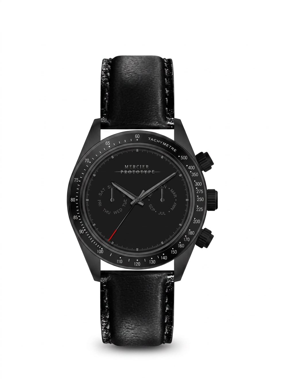
What the tachymeter and pushers are actually for
Two details define the racing-chronograph language, and they're worth understanding rather than dismissing:
The tachymeter is the scale printed around the bezel. Paired with a running chronograph, it converts elapsed time into speed — time a car over a measured mile, read the number off the bezel, and you have its average miles per hour. It is a piece of the watch that means something on a racetrack, which is exactly why it belongs to this design language and nowhere else.
The pushers — the buttons flanking the crown — are the chronograph's controls: start, stop, reset. They're the reason the whole layout exists. On a racing chronograph, every element on that dial traces back to one job: timing a thing that's moving fast.
Carrying that vocabulary forward is a design choice, not an accident. A watch in this lineage wears the marks of where the style came from — the same way a driving jacket keeps its buckles. The question worth asking isn't whether every element is used daily; it's whether the design honors the language it borrows from. The best ones do it on purpose.
Why it still endures
The mechanical-watch revival of the 2000s sent collectors back to vintage chronographs, and the panda dial came roaring back with them. But it never really left, because the thing that made it work on the track makes it work on a wrist: contrast you can read in a glance. Trends rotate through dial colors and case shapes every few years. The panda survives all of them because legibility never goes out of style.
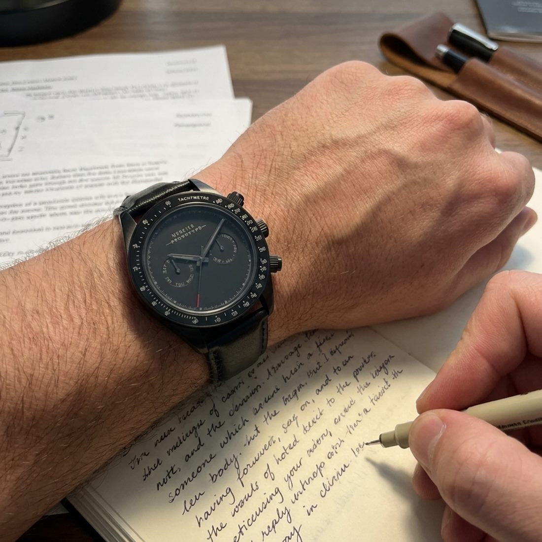
The Manx — Noir & Blanc.
A modern take on the racing-chronograph language: the blacked-out Noir or the crisp white Blanc, the same automatic heart, beneath a domed sapphire crystal. Individually numbered, built to be worn.
See the collection →